Daniel Weil Redesigns Chess Set for Pentagram
Chess blog for latest chess news and chess trivia (c) Alexandra Kosteniuk, 2013
Hi everyone,
Pentagram partner Daniel Weil has created a new design for the chess set, which is making its debut at the World Chess Candidates Tournament in London, according to a nice feature in DesignWeek.
The Staunton set was designed by Nathanial Cook. Weil says, ‘He was an architect, and the set had certain characteristics common to Victoria Neo-Classical architecture. ‘The Knight, for example, is based on the head of the dying horse from the Elgin Marbles, which is why you get that expression of agony.’
Carrying through the Classical theme, Weil linked the eight major chess pieces to the eight columns of the façade of the Parthanon. He redrew the height of the pieces to reflect the pitch of the façade, so that the pieces before play would evoke the structure of a Classical building. Weil was asked to design the new pieces following Pentagram’s earlier work with organisation World Chess, which saw John Rushworth create a new identity for the organisation, Naresh Ramchandani work on campaigns, and Weil design the playing environments.
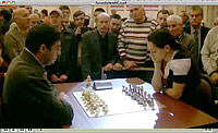
World Chess is operated by entrepreneur Andrew Paulson, who wants to return chess to its 1970s levels of popularity with new interactive and televised coverage. Those competing in the current tournament include 23-year-old Norwegian Magnus Carlsen, who is rated as the best player in history. Weil says, ‘Chess is such an extraordinarily popular pursuit, and we’re aiming to give it more visibility. ‘We want to sharpen the theatricality and allow the players to be the characters that they are.’ A board at the World Chess London Candidates Tournament, with environmental design by Daniel Weil
Weil says he looked to the Staunton Chess Set, first produced in 1849 and used for competitions since then, for initial inspiration. He says, ‘When the initial Staunton set was produced there was great precision – since then a disrepair had set in. I had to unravel the rationale behind the original set.’The Staunton set was designed by Nathanial Cook. Weil says, ‘He was an architect, and the set had certain characteristics common to Victoria Neo-Classical architecture. ‘The Knight, for example, is based on the head of the dying horse from the Elgin Marbles, which is why you get that expression of agony.’
Carrying through the Classical theme, Weil linked the eight major chess pieces to the eight columns of the façade of the Parthanon. He redrew the height of the pieces to reflect the pitch of the façade, so that the pieces before play would evoke the structure of a Classical building.
The Knight, which Weil describes as ‘the least architectural piece’, due to its form and peculiar move (it is the only piece allowed to jump over others) has a base that resembles a hoof.Weil says, ‘The purity of the pieces’ shape is reflected in the way they are held.’ He developed the idea of a ‘north hold’, where the piece is held between the index finger and thumb, and a ‘south hold’, where it is cupped in the hand – Weil says this hold has more ‘theatrical disdain’. Weil also changed the colour of the material under the pieces, which was originally green baize – reflecting chess’s popularity as a Victorian parlour game. The green colour has been replaced by black and white felt.
Weil says, ‘When chess started to become popular in the 19th century it became a social showcase, so everyone had a set on show. I wanted to make an object of quality so that people could also show it off.’
The set is being used in the World Chess London Candidates Tournament, which is taking place at the Institute of Engineering & Technology until 1 April.
Hi everyone,
Pentagram partner Daniel Weil has created a new design for the chess set, which is making its debut at the World Chess Candidates Tournament in London, according to a nice feature in DesignWeek.
The heights of the pieces reflects the facade of the Parthanon. This provides visibility for the pieces throughout the game, while hierarchy is expressed through the width of the pieces, with the King having the largest base
Weil was asked to design the new pieces following Pentagram’s earlier work with organisation World Chess, which saw John Rushworth create a new identity for the organisation, Naresh Ramchandani work on campaigns, and Weil design the playing environments. World Chess is operated by entrepreneur Andrew Paulson, who wants to return chess to its 1970s levels of popularity with new interactive and televised coverage.
Those competing in the current tournament include 23-year-old Norwegian Magnus Carlsen, who is rated as the best player in history. Weil says, ‘Chess is such an extraordinarily popular pursuit, and we’re aiming to give it more visibility.
‘We want to sharpen the theatricality and allow the players to be the characters that they are.’ Weil says he looked to the Staunton Chess Set, first produced in 1849 and used for competitions since then, for initial inspiration.
He says, ‘When the initial Staunton set was produced there was great precision – since then a disrepair had set in. I had to unravel the rationale behind the original set.’
The Staunton set was designed by Nathanial Cook. Weil says, ‘He was an architect, and the set had certain characteristics common to Victoria Neo-Classical architecture. ‘The Knight, for example, is based on the head of the dying horse from the Elgin Marbles, which is why you get that expression of agony.’
Carrying through the Classical theme, Weil linked the eight major chess pieces to the eight columns of the façade of the Parthanon. He redrew the height of the pieces to reflect the pitch of the façade, so that the pieces before play would evoke the structure of a Classical building. Weil was asked to design the new pieces following Pentagram’s earlier work with organisation World Chess, which saw John Rushworth create a new identity for the organisation, Naresh Ramchandani work on campaigns, and Weil design the playing environments.
World Chess is operated by entrepreneur Andrew Paulson, who wants to return chess to its 1970s levels of popularity with new interactive and televised coverage. Those competing in the current tournament include 23-year-old Norwegian Magnus Carlsen, who is rated as the best player in history. Weil says, ‘Chess is such an extraordinarily popular pursuit, and we’re aiming to give it more visibility. ‘We want to sharpen the theatricality and allow the players to be the characters that they are.’ A board at the World Chess London Candidates Tournament, with environmental design by Daniel Weil
Weil says he looked to the Staunton Chess Set, first produced in 1849 and used for competitions since then, for initial inspiration. He says, ‘When the initial Staunton set was produced there was great precision – since then a disrepair had set in. I had to unravel the rationale behind the original set.’The Staunton set was designed by Nathanial Cook. Weil says, ‘He was an architect, and the set had certain characteristics common to Victoria Neo-Classical architecture. ‘The Knight, for example, is based on the head of the dying horse from the Elgin Marbles, which is why you get that expression of agony.’
Carrying through the Classical theme, Weil linked the eight major chess pieces to the eight columns of the façade of the Parthanon. He redrew the height of the pieces to reflect the pitch of the façade, so that the pieces before play would evoke the structure of a Classical building.
The Knight, which Weil describes as ‘the least architectural piece’, due to its form and peculiar move (it is the only piece allowed to jump over others) has a base that resembles a hoof.Weil says, ‘The purity of the pieces’ shape is reflected in the way they are held.’ He developed the idea of a ‘north hold’, where the piece is held between the index finger and thumb, and a ‘south hold’, where it is cupped in the hand – Weil says this hold has more ‘theatrical disdain’. Weil also changed the colour of the material under the pieces, which was originally green baize – reflecting chess’s popularity as a Victorian parlour game. The green colour has been replaced by black and white felt.
Weil says, ‘When chess started to become popular in the 19th century it became a social showcase, so everyone had a set on show. I wanted to make an object of quality so that people could also show it off.’
Boxed-up chess set
The set is being used in the World Chess London Candidates Tournament, which is taking place at the Institute of Engineering & Technology until 1 April.
From Alexandra Kosteniuk's
www.chessblog.com
Also see her personal blog at
www.chessqueen.com
Don't miss Chess Queen™
YouTube Channel
www.chessblog.com
Also see her personal blog at
www.chessqueen.com
Don't miss Chess Queen™
YouTube Channel
Labels: boxed chess set, daniel weil, world chess candidates 2013


1 Comments:
At May 24, 2013 at 9:49 PM , Unknown said...
New design Staunton Chess Pieces
Post a Comment
Note: Only a member of this blog may post a comment.
Subscribe to Post Comments [Atom]
<< Home